Hypothesis Testing Results Help Page
More information on how to start an analysis can be found in our Hypothesis Testing Analysis Guide
Steps to View Results:
-
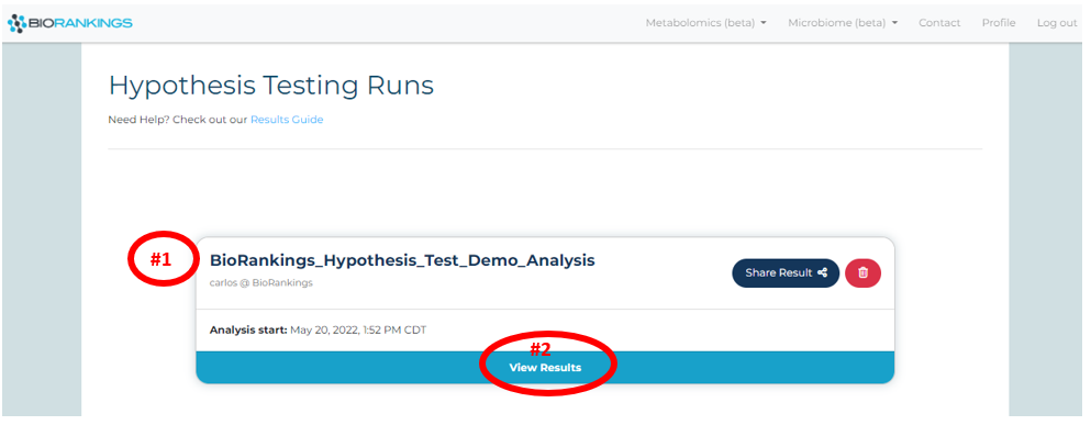
Once an analysis is complete it will appear on the
results page.
Click ‘View Result’ for more options and to view more information on that result. Below the test
name used from the demo data is shown with a red #1 and the 'View Result' is shown with a red #2.
-
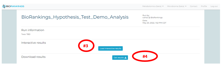
Click on ‘Load interactive results’ to load the interactive results page (red #3). Your interactive
results page will then begin loading and may take a few minutes. The ‘Get results’ button (red #4) will
send an email with the .pdf and .csv result files.
-
You will see a button labeled ‘View interactive results’ (red #5) once the loading process is
complete. Click the button and a new tab will pop up with your interactive results.
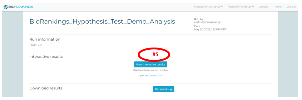
-
The interactive results page is available for 3 hours. You can always re-open a new
interactive window by going back to the result page and re-clicking ‘Load interactive
results’.
What do the results mean?
-
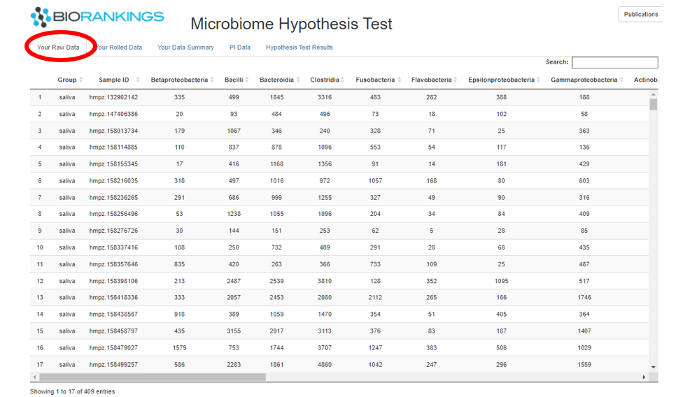
The first table displayed under the tab ‘Your Raw Data’ shows the taxa count data you uploaded for the analysis.
The first column of this table will be filled in with the group name inputted when submitting the analysis.
The image below shows the raw data from the demo data.
-
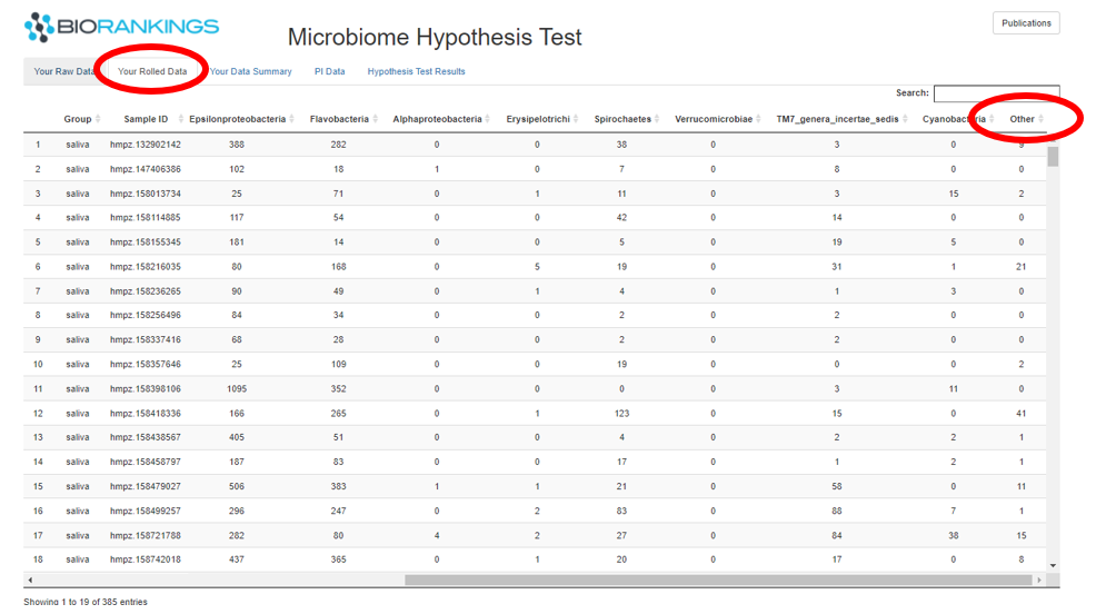
The second tab is ‘Your Rolled Data’ and matches the raw data except that the rare taxa are collapsed together
into a group labeled ‘Other’. This is shown in the screen show below. Samples with low read counts will also be
dropped from this table.
-
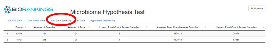
The ‘Your Data Summary’ tab summarizes the taxa data by group. The image below shows the 2 demo data groups.
The first column is the group label while the second and third columns show the number of samples and taxa in
each group respectively. The remaining 3 columns are the minimum, average and maximum read counts across samples
within each group.
-
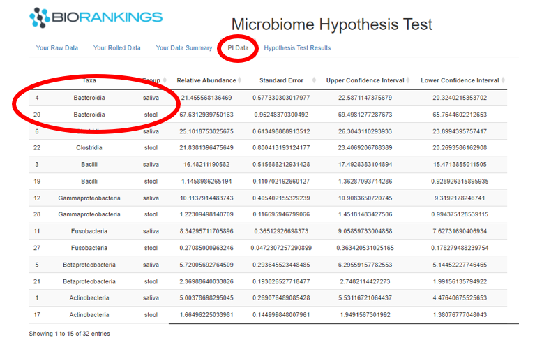
The 4th tab presents the results of the Dirchlet-Multinomial estimates. Each row in this table represents a taxa
for each group. The large circle in the image below shows that the taxa, Bacteroidia, accounts for roughly 21% of
the microbiome in the saliva group and 67% in the stool group. The last 3 columns in this are the confidence
interval estimates.
-
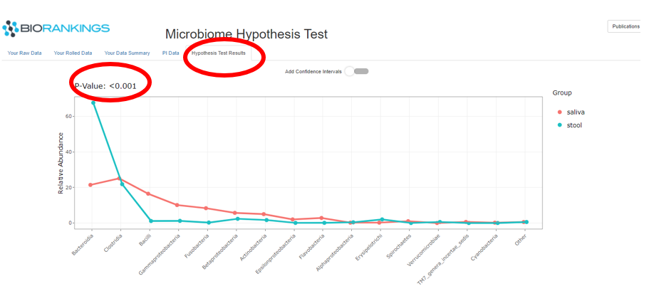
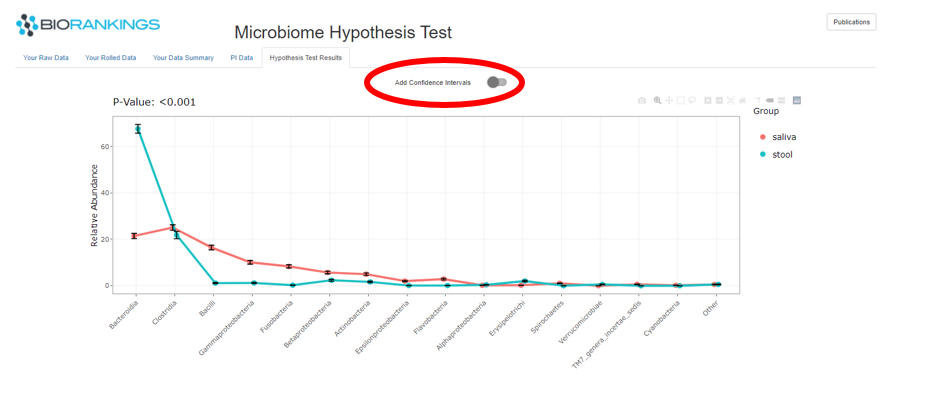
The last tab ‘Hypothesis Test Results’ has the results of the hypothesis test in the form of a ‘PI’ plot.
The image below shows the microbiome distributions for the demo data groups. The Y - axis represents the relative
abundance out of 100% and the X - axis defines each taxa. Saliva is represented by the red line and stool is
represented by the green curve. The p-value of the hypothesis is displayed in the top left corner and is circled in red.
In this example the p-value is <.001, therefore rejecting the NULL hypothesis that the microbiome compositions are the same.
-
You can choose to show the confidence intervals for each composition by clicking on ‘Add Confidence Intervals’
If you have any issues please do not hesistate to contact us