Metabolomics Result Guide
More information on how to submit an analysis can be found in our Submitting an Analysis Guide.
Viewing and interpreting results
Result anomalies
- Why do my features not look like peaks?
- Why do my features have missing or unexpected annotation?
- Suggestions for optimal results
Please contact us if you still need help with your analyses or results.
Steps to View Results:
-
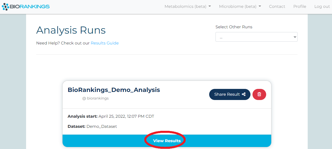
Once an analysis is complete it will appear on the
results page. Click ‘View Result’
for more options and to view more information on that result.
-
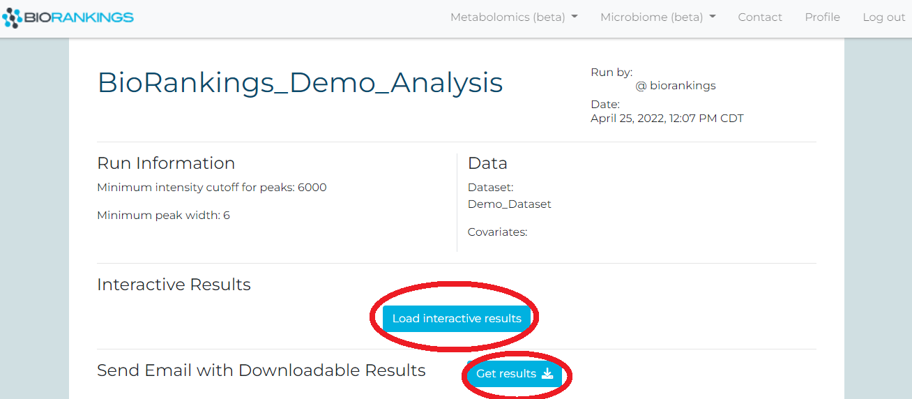
Click on ‘Load interactive results’ to load the interactive results page. Your interactive
results page will then begin loading and may take a few minutes. The .pdf and .xlsx files
are also available for download from this page with the ‘Get results’ button.
-
You will see a button labeled ‘View interactive results’ once the loading process is
complete. Click the button and a new tab will pop up with your interactive results.
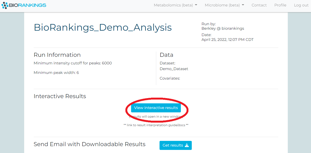
-
The interactive results page is available for 3 hours. You can always re-open a new
interactive window by going back to the result page and re-clicking ‘Load interactive
results’.
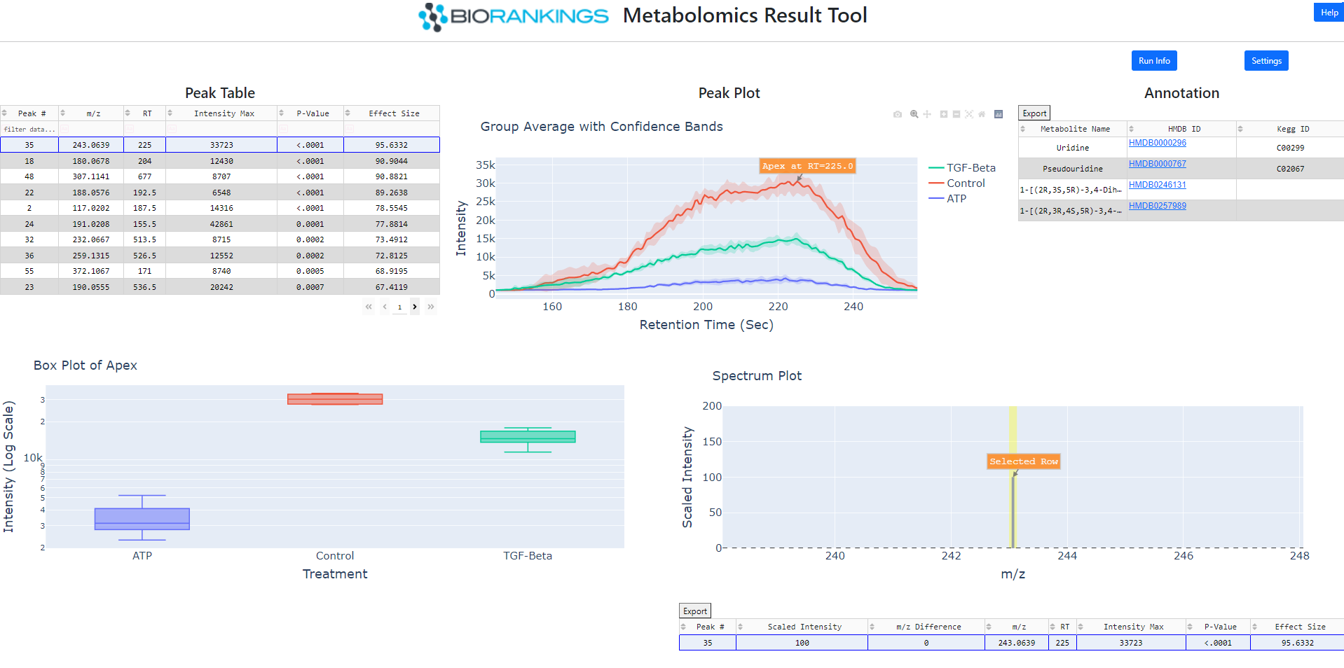
What do the results mean?
-
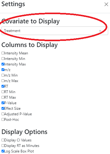
By default the interactive results page will display the first covariate but the covariate
being displayed can be changed from the settings menu.
Additional the columns displayed in the peak tables and some plotting options can be changed here too.
-
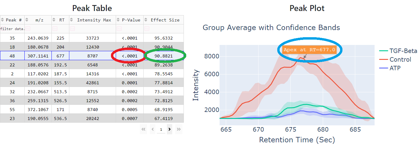
The example below shows the third row selected in the peak table and its average intensity
for each of the 3 groups with 95% confidence intervals. Th 'P-Value' column (red circle)
in the peak table shows <.0001 indicating that these groups are statistically different.
The 'Effect Size' column (green circle) indicates the magnitude of the difference. The
label in the peak plot (blue circle) highlights the apex of the feature.
-
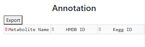
The currently highlighted third row does not have any annotation matches as shown below.
However any potential matches to the currently selected feature and a link to HMDB for
each canidate will be displayed in this table.
-
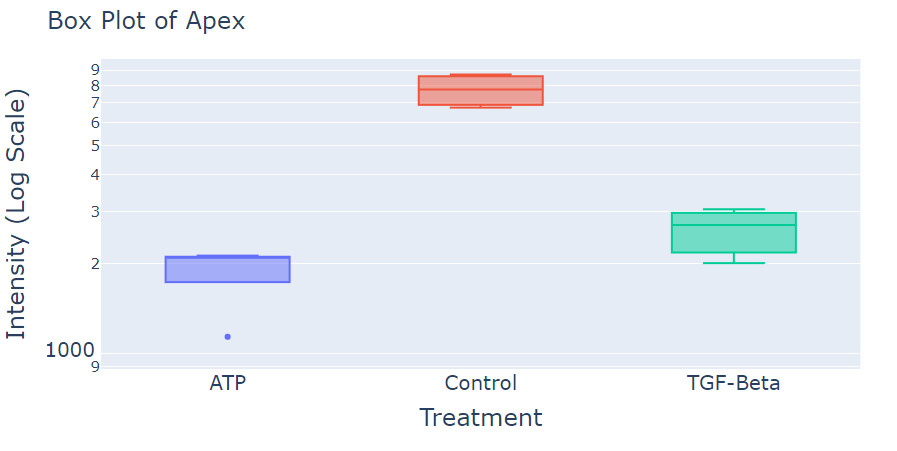
In the next image, the box plot is shown. Each box represents the apex information for
each of the groups. The y-axis can be unlogged via the settings menu.
-
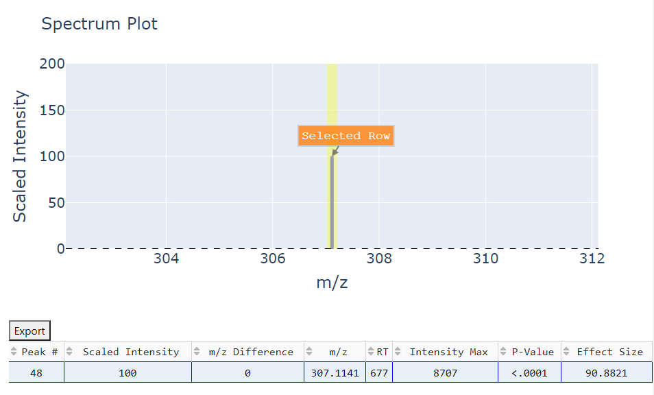
The spectrum plot shows nearby features that may be releated to the selected feature. The
table below displays the same statistics as the peak table but clicking on a row will
label that selected row on the plot.
If you have any issues please do not hesistate to contact us.
Result Anomalies
| Why do my features not look like peaks?
Our algorithm is optimized to find the best features in MS1 data only. If your experiment collected more than MS1 information (example: MS2, fragmentation..) this will contribute to features not looking like peaks.
Collecting multiple types of data in a single machine run reduces scan rates that lead poorly defined features. Currently, this type of data is not supported in the beta version of our software.
| Why do my features have missing or unexpected annotation?
Our algorithm uses the HMDB library. If you need additional assistance or need a different library, please contact us.
| Suggestions for optimal results
Most of the time, the issue is related to improper data format or type. Our algorithm is optimized to find the best features in MS1 data only. If your experiment data is similar to the example data you can expect the most ideal results.
Please contact us if you still need help with your analyses or results.